For as long as I can remember, Opera Browser was the cool kid in town. From having a unique and modern design, features such as the Speed-Dial, and trying new things that no one else was, including the Opera GX, Crypto, and even Neon, the browser has seen major changes over the past decade, but is it worth it?
I’ve always been a nerd when it comes to web browsers, using and testing as many as I could find. From browsers that don’t even exist on Windows to newly released and one-of-a-kind software such as the Arc Browser, those are the apps that we constantly use and can make a lot of difference when it comes to working and surfing the web.
When Opera Browser announced that they were ditching their own proprietary layout engine, Presto, back in 2013, and were building a Chromium-based browser from scratch, I was nervous to see where the browser was headed and what its future holds.
When Vivaldi Browser was released on 27 January 2015, that was the last time I used Opera. Years later, I thought to give it another try, and see what the browser changed, improved, and where it’s basically headed, and here’s everything I know so far.
Opera Browser has some neat features
If there’s one thing I can safely say, is that Opera Browser has kept its momentum and its uniqueness by creating and introducing new features. It also has a new design and an interface that, while it gives you the same familiarity as any other browser, meaning that it’s pretty easy to use, it’s different, but in a good way.
Stickers in the browser’s tabs
While someone could debate that stickers are for children, I love them, and in Opera Browser, they’re more useful than I thought they were. I mean, don’t get me wrong, having fun while browsing the web or working shouldn’t be that difficult, and small features like this can make a difference.
With the latest version, users have the ability to choose and add any sticker they like to any tab. Here’s an example:
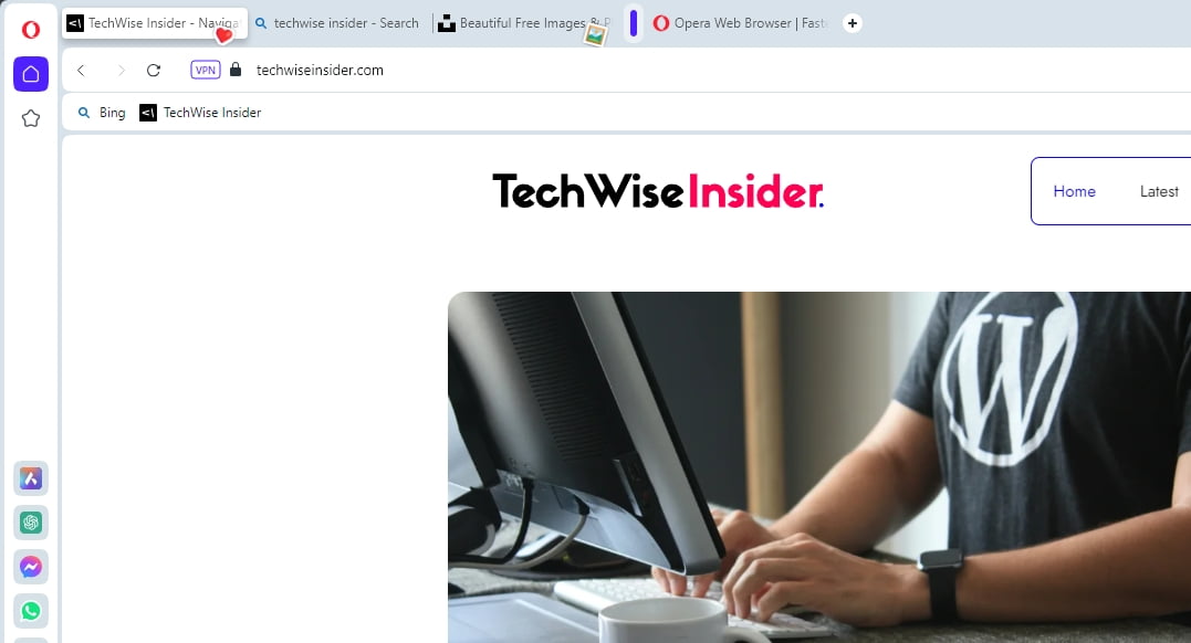
The only thing you’ll have to do is hover any tab with your cursor, and the option will appear. I don’t know why, but I quickly fell in love with this feature, and I kept using it while I was testing the browser like it were the only thing that I cared about.
But the best thing about this feature – and most of the others that we will be talking about next – is that you won’t have to use it if you don’t like it. Tabs are clean and minimal, as they should be, and if you’re not into stickers, you’re not going to be seeing them.
A useful sidebar
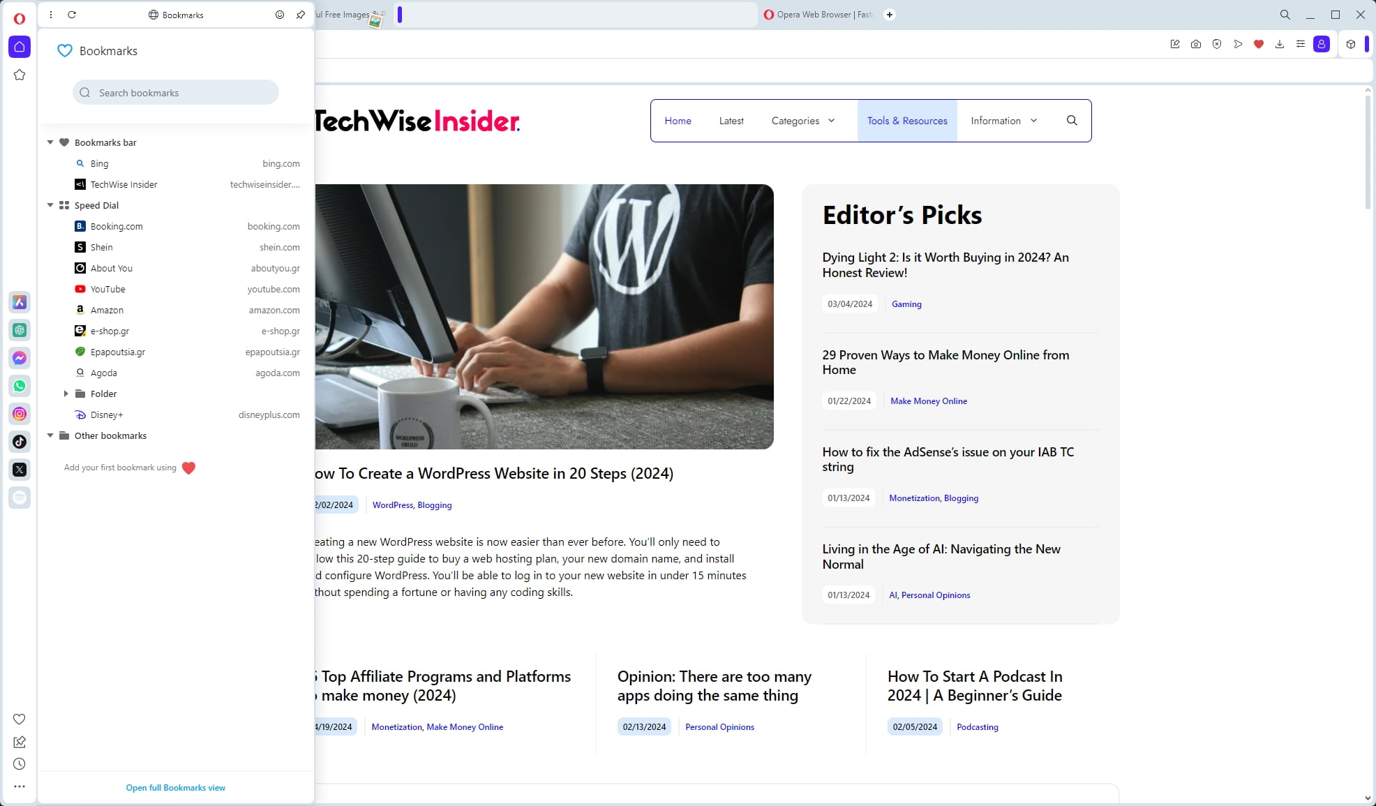
Once you open the browser for the first time, one of the things that you’ll notice is the sidebar on the left side of the app. This is where many of Opera’s features live, and you can access many of your favorite third-party services by simply clicking on them. Apart from the default options, such as your bookmarks, workspaces, pinboards, and history, you can also enable third-party popular apps, including ChatGPT, Instagram, TikTok, and many others.
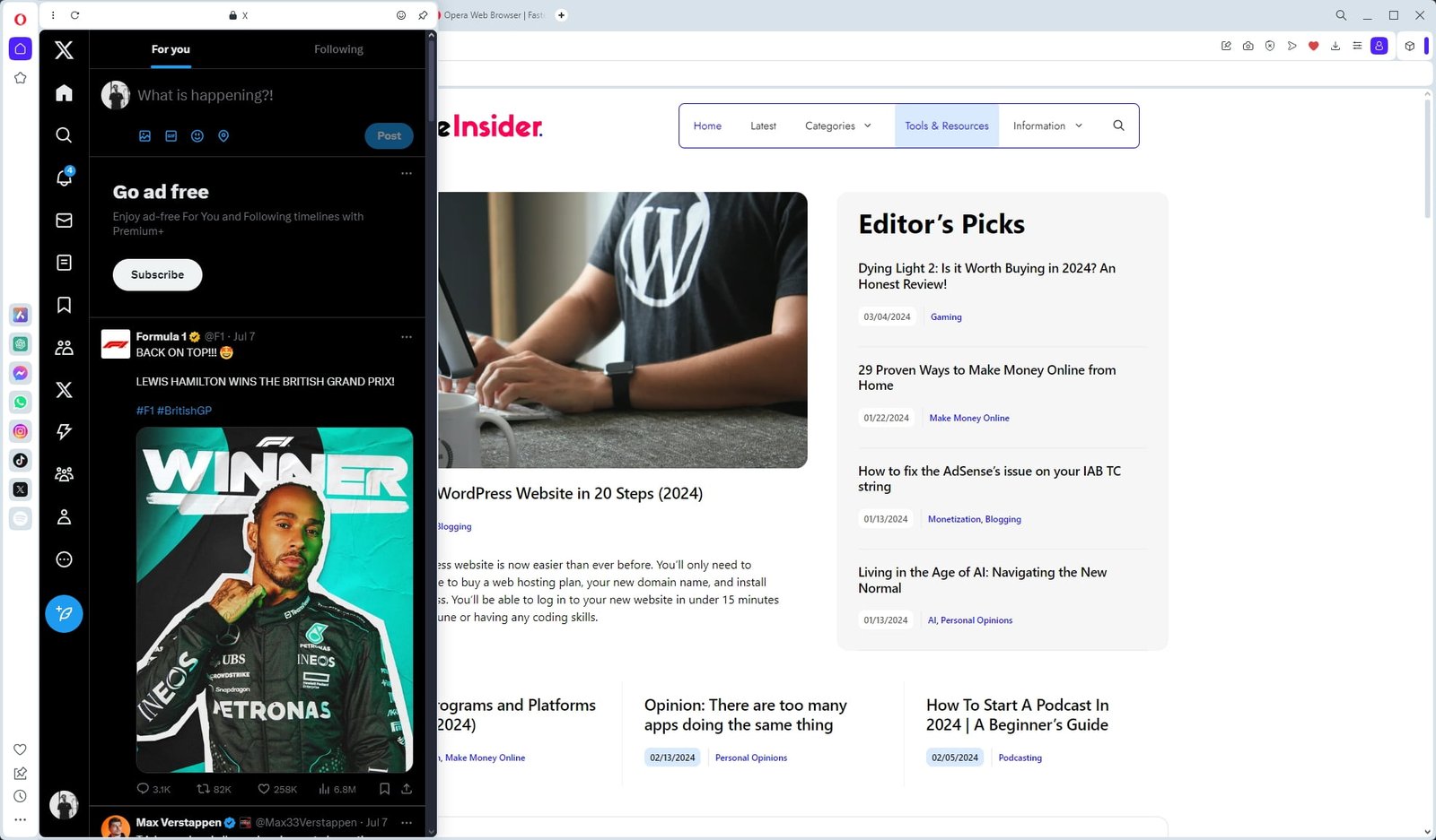
You can access every website or service with a click, and if you feel like the sidebar is taking space out of your browser’s window, you can always disable it or enable the “auto-hide” feature, which will display it every time you hover your cursor on the left side. There’s also a dedicated page from which you can download and install more third-party extensions that perfectly work with Opera’s sidebar, which makes it even more neat.
Unfortunately, I haven’t found a way to add my favorite websites to the left sidebar, like I used to do with Vivaldi Browser, but even so, it’s a great little feature.
The Speed Dial is still here
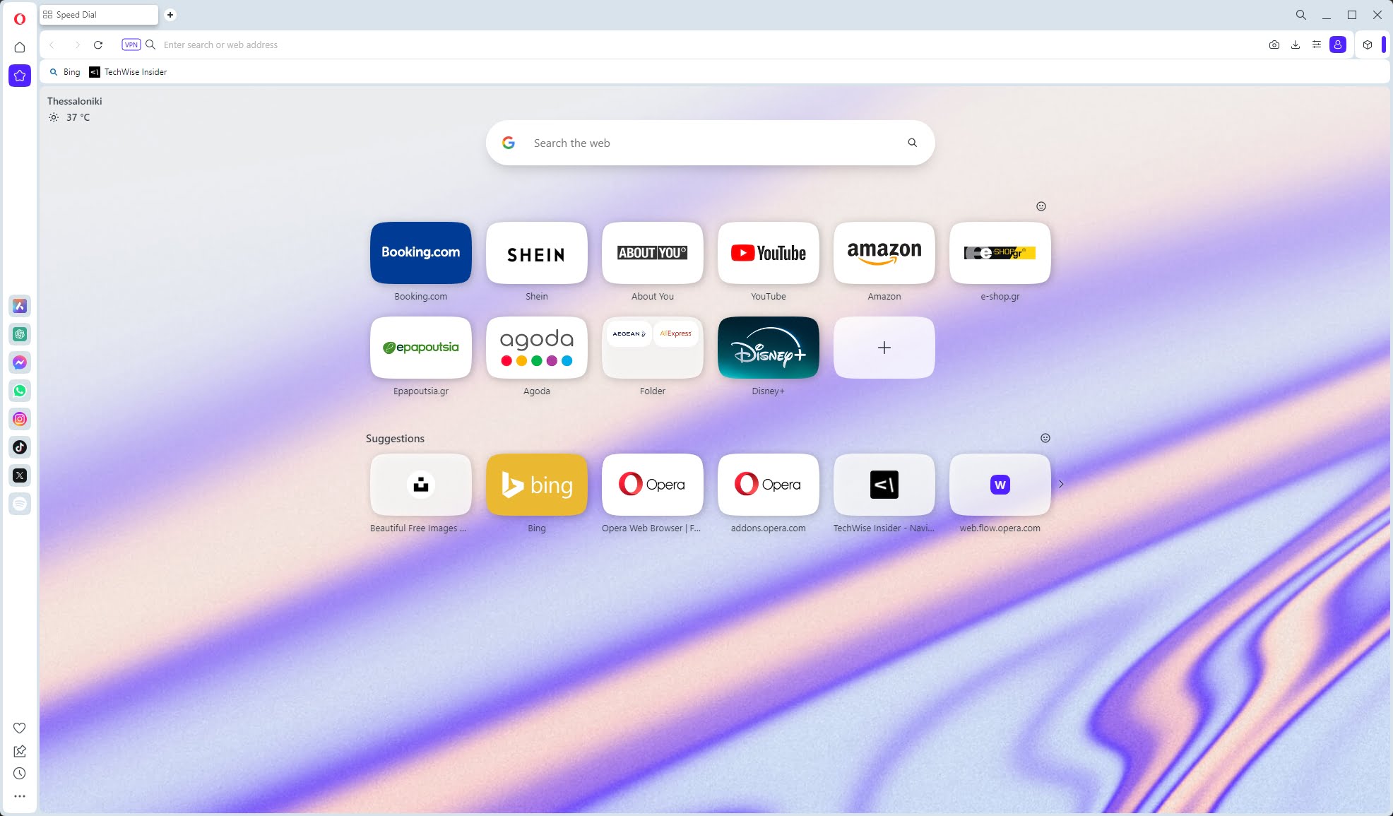
The Speed Dial has been one of my favorite Opera features for as long as I can remember, giving me a great way to organize my bookmarks and have all my go-to websites one click away. Although not as robust and feature-rich as Vivaldi’s Speed Dial, it’s still here, and you can use it to save anything that you visit often or want to read later.
Opera has a few default websites sitting there, but you can always remove them and add your own, create folders for better organization, and move anything by dragging it. You can also enable the Opera News section in the Speed Dial, which will display the latest news just below your icons.
Changing between the Speed Dial’s wallpapers or adding your own is also easy and straightforward, and there’s also a Google search field that you can change to another search engine or completely remove.
You can install any extension
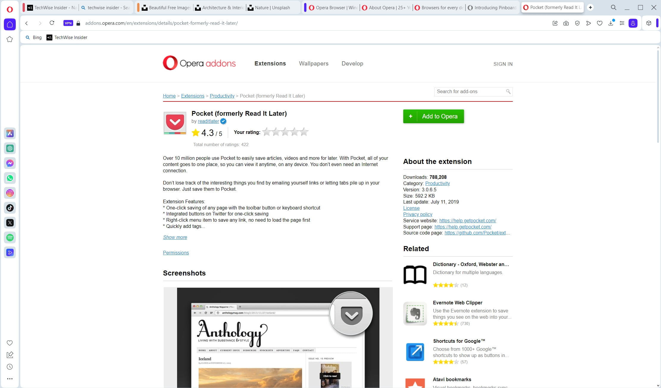
Opera has always had its own Opera Addons page from which users can download and install any extension that is available for the browser, and it has a big list of options when it comes to extensions. There’s also a dedicated page for extensions that specifically work for its left sidebar, as I’ve mentioned before, but being a Chromium-based browser means that you have even more options.
Opera users can also visit Google’s own Chrome Web Store and install every extension found there, as they’re all compatible with the browser. That means that if there’s an extension missing from Opera’s Addons page, you can easily find it and install it through the Chrome Web Store, exactly as you would if you were using Chrome.
Although you don’t get the extension that you’re looking for, I couldn’t stop thinking about the design you get on their official add-ons page. It looks so outdated when it comes to its front page and landing pages, which kept driving me away to Google’s own Web Store.
Flow file sharing
Flow File Sharing is a feature provided by Opera, and it is built into the browser. You can use this feature to quickly send files through your devices, from your PC to your phone and vice versa.
Although I wasn’t expecting to use this feature, sometimes when I was surfing the web using Opera’s mobile browser on my Galaxy device, I sent a few articles, videos, and other types of content that I wanted to check out from my PC later – and it was as easy as it sounds.
First, you’ll have to enable the My Flow feature from the left sidebar, and then you can quickly connect it by scanning the QR code using your mobile device. That would synchronize the My Flow and let you easily share your favorite links between devices.
Tab Islands
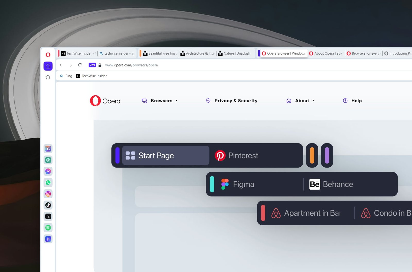
Tab Islands is what Opera calls its feature that lets anyone separate their tabs into different groups. Basically, it’s just adding tabs into other tabs, and it makes organization a whole lot easier. This is a feature that I’ve always found on Vivaldi, a browser that had this feature before any other browser, and one of the reasons I switched to it.
While this may sound pretty easy to use, it actually took me a while to find out how to use those Tab Islands, and it’s not as straightforward as it should be. To help you out, though, you can easily create a Tab Island by right-clicking on a tab and creating a new Tab In Island. I haven’t found a way to rename those groups, and I have no idea which is which, so it wasn’t too useful for me, and certainly not as good as Vivaldi’s tab-stacking feature.
I do love the colors being displayed in every Tab Island, but Opera chooses a color automatically every time you create a new Tab Island, and you don’t have the option to change that. Last but not least, you can always create a new Speed Dial folder from Tab Island by right-clicking on the group.
Everything you need to know about Opera’s design
Opera always found a way to give its users a unique, modern, and slick design that made the whole browser’s interface different and fun to use. The same goes for the current version, as it stands out from other interfaces, and with its rounded corners, it’s yet again another improvement from its preview versions.
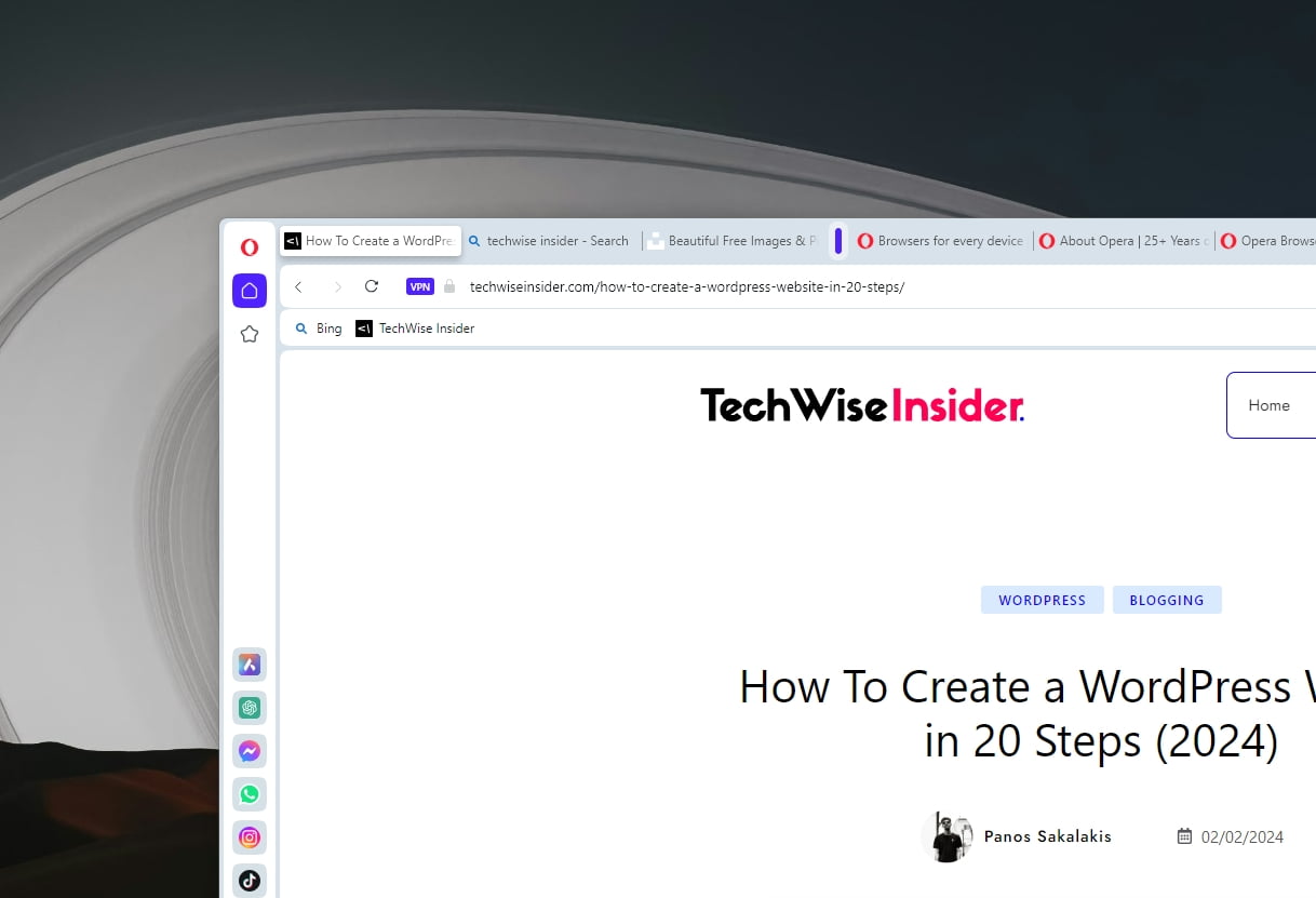
I’ll start by saying that I loved their minimal approach, but when it comes to the active tabs, my feelings are mixed. Active tabs have these weird shadow that makes them stand out from other tabs, but when it comes to having a modernized interface, this ain’t it.
Active tabs, as for my personal taste and preferences, look like they’re unfinished by the developers, but they had no time, so they thought publishing them in a beta version would be just fine. It isn’t.
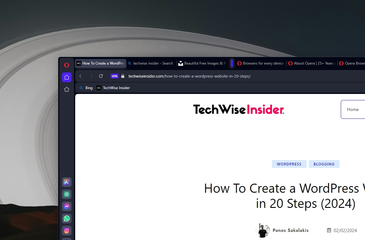
The active tabs are the only thing that I didn’t like in Opera Browser, and an important design aspect that I simply can’t overlook. Maybe if they reduce the shadow a bit, it will look more modern and neat, or maybe it won’t, but the current styling of the tabs feels outdated. I did like the dark mode more, especially when it comes to the active tabs, but even so, I felt that they needed to improve the styling in that area.
Opera’s VPN and Ad-Block features
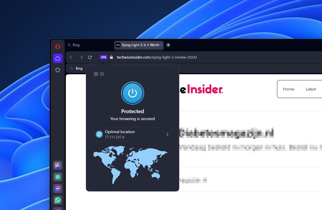
When it comes to blocking ads and stopping advertisers and third-party companies from tracking you, Opera has its own built-in VPN that works like a proxy. It’s easy to use, blocks most ads, and has the option to allow acceptable ads, as they say.
Most importantly, Opera lets its users enable the VPN service from their settings, allowing them to mask their IP addresses and surf the internet in a more secure and private way.
Unlike a VPN app, which encrypts your whole device, Opera’s VPN can only route your browser traffic through a proxy server. While this is great for accessing restricted content, it won’t protect your whole device, but it’s still free and unlimited for anyone interested.
If you’re looking for a true VPN that will protect all of your devices without restrictions or limitations, I’ll suggest Surfshark VPN, which is the one app that I have running both on my desktop PC and smartphone at all times.
When it comes to Opera’s VPN, I remember it being pretty slow and laggy, and most of the time that I’d tried it, let’s say that the experience wasn’t that great. In my latest tests, their VPN worked great when I had it in the optimal location. I was able to watch all of my favorite videos without any issues, and it was able to perfectly play even 4K videos.
Conclusion…
Opera is a great choice for both standard and more advanced users; it has tons of great features, doesn’t lack any speed, and can easily handle any website or online service thanks to being a Chromium-based web browser.
Apart from that, it’s a browser that needs a few improvements to get even better, including making its Tab Islands more recognizable when you have enough of them open at the same time, so you won’t lose any time searching for the right group tab.
The browser – based on my personal preferences, of course – also needs to improve its tab styling, which feels weird. It’s not bad, though, and it won’t play a role when it comes to using the browser or surfacing through the web, but I find it less aesthetic.
Have you used the Opera Browser lately? And if so, how was your experience with the browser, and what did you like and hate the most about it? Let me know in the comment section below.







Nice to see your post. I’ve used opera since I started using a computer. 🙂 However, the settings are lengthy in the latest versions. It feels like forever. I mainly use the browser for torrents. If I am to think of security, I’d pay for a VPN service and may use Tor or more specific tools. I still find the mobile browser amazing through. Chrome has its new-wave kind of supporters, firefox has idealist people, and Safari has the dumb people. Now, unless opera gets into a radical something, it will sit in the same league of Internet Explorer.
Nice to see your post. I’ve used opera since I started using a computer. 🙂 However, the settings are lengthy in the latest versions. It feels like forever. I mainly use the browser for torrents. If I am to think of security, I’d pay for a VPN service and may use Tor or more specific tools. I still find the mobile browser amazing through. Chrome has its new-wave kind of supporters, firefox has idealist people, and Safari has the dumb people. Now, unless opera gets into a radical something, it will sit in the same league of Internet Explorer.